
There is so much that goes into building a website. As academics, the content and research are easy. However, creating the visual side of your website can feel overwhelming when you are starting from scratch. One of the best ways to organize all your ideas, inspiration and create a visual story for your brand is… a mood board!
So how do you actually create a mood board?
One of the most critical steps in building a website is knowing your audience, and a mood board is no different. Before you start choosing visual elements for your mood board, think about who you are targeting. Are you targeting students? If so, are they currently enrolled, or are you trying to recruit high school students? Are you targeting colleagues who have little knowledge of your research topic or colleagues who share the same topics from around the world? Or are you targeting the community? Once you have answered those questions – use that audience to drive your decisions about what to include.
Once you have defined your audience, it’s time to start designing your mood board. While there is no one-size-fits-all approach, there are a few design elements I think every mood board should consider including.
Color
When choosing your design elements to include on your mood board, color is a great place to start. Your color palette is one of your most vital visual elements. The colors you choose send a message about who you are and how your audience receives your website.
Think about the message you are trying to create and choose a color palette that reflects that message. Are you going for a laid-back, beachy feel? Then pale blues and light browns would make sense. Is your message for kids? Then, bright oranges and reds are the way to go. I recommend choosing 5 colors, some bold and some dull, some bright and some dark.
When trying to choose a color palette coolors.co and Adobe Color are great places to get inspiration.
Whatever color palette you choose, make sure to include swatches in your mood board.
Photos/Images
The famous quote “a picture is worth a thousand words” is important to remember when creating your mood board. Look for photographs, illustrations, and other patterns or imagery that you feel align with your message and tell your story. For example, if your research is on sunscreen and you are creating a laid-back, beachy feel website, then you might include stock photos of the beach or the sky. You can even step it up a notch and include your own personal photography.
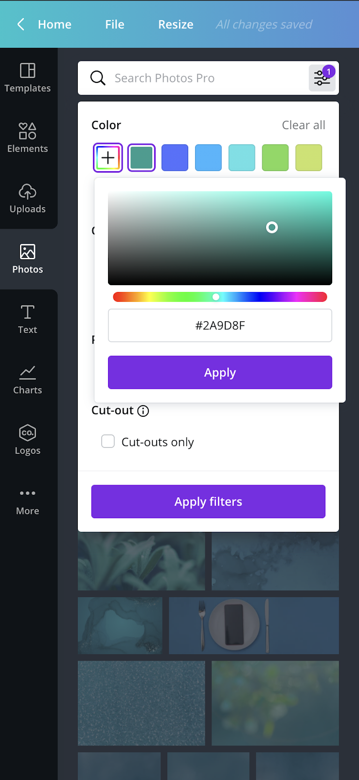
Using the color filter while searching for stock photos in Canva is a great way to gather photos and imagery that also align with your color palette.
Whatever images you choose, be sure to include a few in your mood board.
Fonts
Fonts have to be chosen very carefully when creating a visual identity. Just like the color palette, the fonts you choose can send a message to your audience about who you are. I recommend choosing two fonts, three at most.
One font will be your primary font, used for the body of your text. The next font will be your secondary font, which will be used for headings or parts of the text that need accents. Sans serif fonts are clear enough to serve as your primary font, while hand-written fonts will work better as secondary fonts.
Fontpair.co is a great place to get inspiration on different font pairs.
Whatever fonts you choose, be sure to include the font name and some filler text for your heading and body fonts so that you can visualize how they’ll look when applied.
In Action
As I mentioned earlier, mood boards are not one-size-fits-all. If you are curious about what a finished mood board looks like, take a look at a few boards I have created in action.

